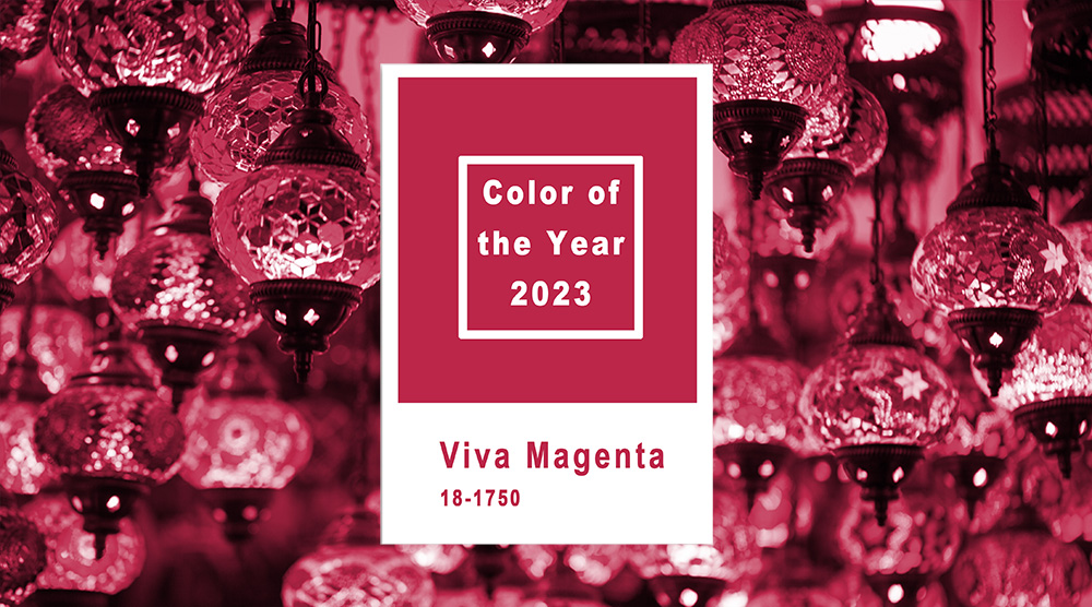
Know the Top Color For 2023 is Viva Magenta
The Pantone Color Institute, the global color authority, has picked its 2023 Color of the Year.
This color choice will affect the graphic design, fashion, beauty, and home décor industries. Even technology, so it’s a big deal. The institute has been revealing a new Color of the Year every December for the past couple of decades. The color for 2023 is Viva Magenta, “a nuanced crimson tone—an unconventional shade for an unconventional time,” according to Pantone’s announcement statement.
We look forward to the color unveiling since it will be a new color in the Pantone Matching System that we as graphic designers use to communicate with our clients and our printers. It’s something we consider as we stay up with modern design trends.
The catch-22 for designers is to get the use of the new color just right.
If used too much (to be “with it”), it becomes dated and limits long-term use. It’s not usually a problem since modern collateral pieces aren’t meant to last more than a year or two. But if a designer uses the Color of the Year in a logo, that logo might not look right 10 to 15 years down the road. Logos are meant to last.
Interior designers might have the biggest problem since locking in on the Color of the Year may date their whole interior color scheme. Come to think of it, it’s the homeowner who gets stuck with an outdated color. The designer is on to the next project.
When red is a color to avoid.
We consider color longevity in coming up with the look and feel of the pieces we design, but occasionally we run into colors to avoid. Red (crimson, even magenta being a variant of red) sometimes doesn’t play well within an industry. For example, while designing a recent communication for a dental practice, we were warned, “no red.” Doctors, dentists, and medical practitioners are told in their marketing seminars to stay away from anything that looks like blood, for obvious reasons. Red subconsciously scares the viewers. Pantone’s 2023 pick might not play well for doctors and dentists. Stick to blues, greens, cool, soothing colors. For instance, think of Listerine mouthwash. Any “cinnamon” flavors? Heck no. Just Cool Mint (blue), Sea green, and the like. Closest thing to red is a warm yellow (original flavor). Guess it looks antiseptic.
Pantone hypes Viva Magenta at Miami Magentaverse.
Sometimes the Pantone Institute gets a little carried away with its own marketing hype in my humble opinion. Magenta. It’s a type of red, right? Nah! According to their press release, Viva Magenta is “rooted in the primordial, reconnecting us to original matter. Invoking the forces of nature, it galvanizes our spirit, helping us to build our inner strength.” Yikes.
To make sure you believe this hoopla, Pantone invites you to Miami for their new exhibition dubbed the “Magentaverse” described, along with other promotions, by Fast Company https://tinyurl.com/34ns4v5b. According to Pantone, the exhibition “explores the dynamic between Artificial Intelligence and human creativity through interactive rooms featuring visual, auditory and tactile experiences linked to Viva Magenta.”
Wow. I had no idea a color I have enjoyed over a lifetime could rock my world so much! But there you have it. Keep an eye out for it. And be sure to let us know if we are using it a bit too much. You can bet we’ll try to keep it away from any medical clients.


0 Comments